Artist Branding on a Budget: Building a Visual Identity That Sticks
You don't need a design degree or a big budget to build a memorable artist brand. Here's how to create a consistent visual identity using free tools and smart thinking.
TL;DR
Consistent visual branding makes you memorable and professional. Choose 2-3 colours, 1-2 fonts, and a visual style that reflects your music. Use Canva for artwork, maintain consistency across all platforms, and prioritise cohesion over perfection. Your brand is how people recognise you before they hear a note.
Why Visual Branding Matters for Musicians
In a world of infinite music, visual identity is how listeners remember you. Before they hear your music, they see your artwork, your social media, your press photos. A consistent, distinctive visual identity creates recognition and signals professionalism — both of which influence whether someone presses play.
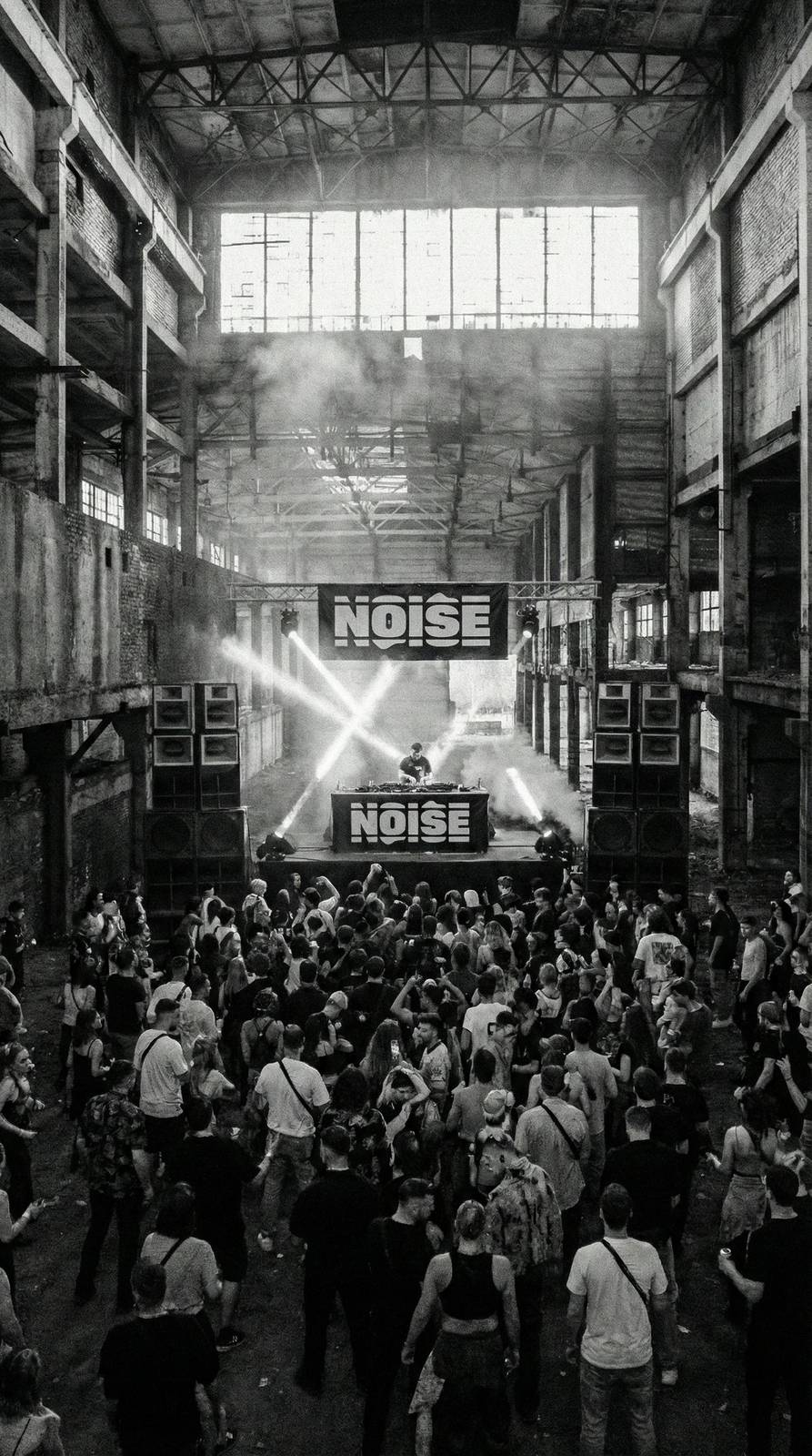
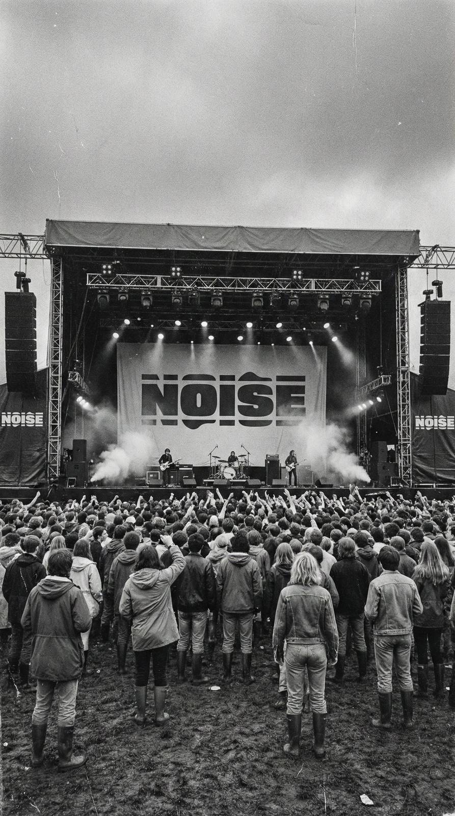
Think about the artists you admire: you can probably picture their visual world instantly. The 1975's neon minimalism, Tyler the Creator's colourful chaos, Billie Eilish's green-and-black era. These visual identities are inseparable from the music — they create a total artistic package that's greater than the sum of its parts.
For emerging artists, visual branding serves a practical purpose too. Consistent aesthetics across your Spotify profile, Instagram, TikTok, press materials, and artwork create the impression of a together, intentional project. It signals to industry professionals that you think about your career holistically, not just musically.
Defining Your Visual Identity
Start with your music's emotional character. Is it dark and moody? Bright and energetic? Warm and intimate? Cold and angular? Your visual identity should evoke the same feelings as your music. A hardcore punk act with pastel aesthetics creates confusing cognitive dissonance; a dreamy shoegaze project with harsh, industrial visuals does the same.
Choose a colour palette of 2-3 primary colours that reflect your sonic identity. Dark, desaturated tones for moody music. Bold, saturated colours for energetic music. Earth tones for organic, folk-influenced sounds. Once chosen, use these colours consistently across everything — artwork, social media graphics, merchandise, stage design.
Select 1-2 fonts that match your vibe. Sans-serif fonts feel modern and clean. Serif fonts feel classic and literary. Handwritten fonts feel personal and raw. Whatever you choose, use the same fonts across all materials for instant recognition. Free font resources like Google Fonts and DaFont provide thousands of options.
Free and Low-Cost Design Tools
Canva is the best free design tool for musicians. It provides templates for social media graphics, album artwork, posters, and more, all customisable to your brand colours and fonts. The free tier is genuinely generous, and the Pro tier (about £10/month) adds brand kit features that maintain consistency automatically.
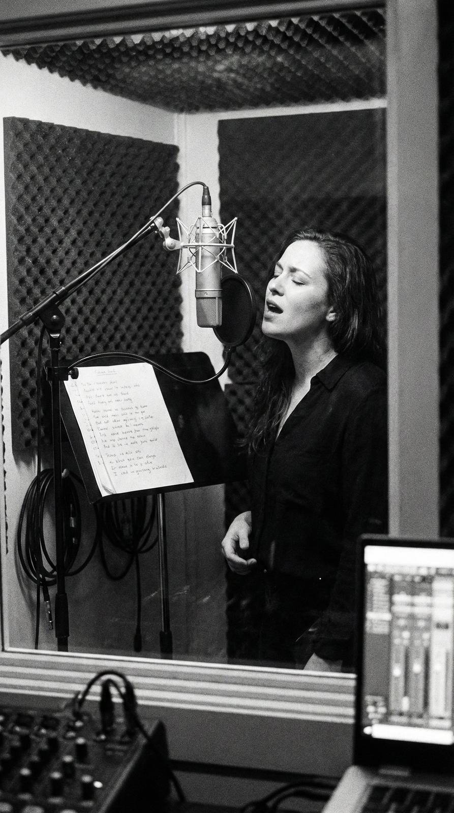
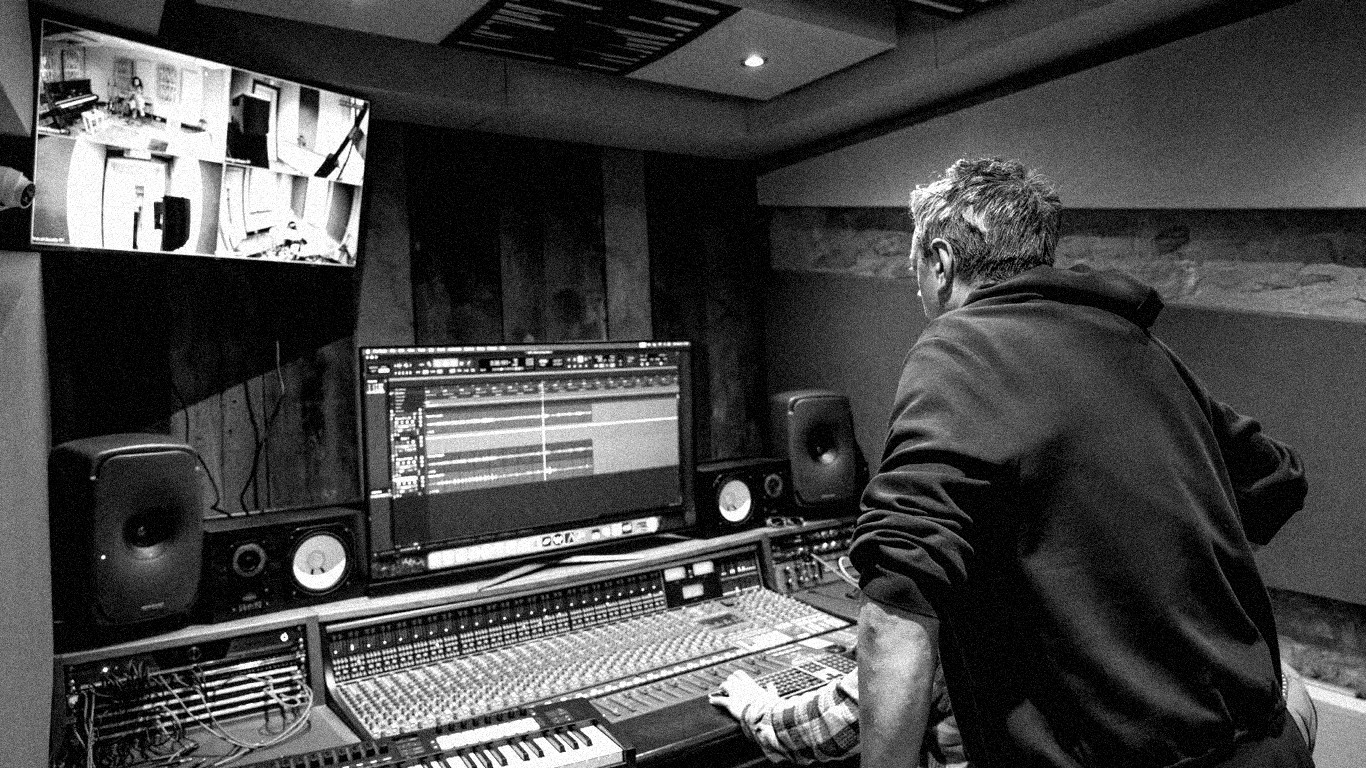
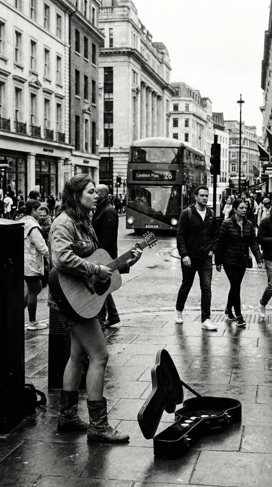
For press photos, you don't need a professional photographer. A friend with a decent phone camera, good natural lighting, and an interesting location can produce usable press shots. Shoot against simple backgrounds, use the golden hour (the hour before sunset) for warm, flattering light, and take many more photos than you think you need.
Dalle, Midjourney, and similar AI image generators can create distinctive artwork concepts that you then refine. While we'd caution against using AI-generated images as final artwork (the ethics and copyright are murky), they're useful for mood boards and concept development that guide your visual direction.
Applying Your Brand Across Platforms
Consistency is the core principle. Your Spotify artist image, Instagram profile picture, TikTok avatar, and YouTube channel art should all clearly belong to the same project. Use the same colour palette, typography, and photographic style across everything.
Create templates for recurring content types. A social media post announcing a new single should have a recognisable format that fans associate with your releases. A template for gig announcements, another for behind-the-scenes content, another for personal updates — each following your brand guidelines while serving different purposes.
Your artwork is your most visible brand element. Single and album artwork should be cohesive with your overall visual identity while having enough individuality to distinguish different releases. Consider creating a visual series — similar compositional approaches or colour treatments across releases — that creates a recognisable catalogue.
Evolving Your Brand Over Time
Your visual identity should evolve as your music evolves, but gradually rather than abruptly. A complete rebrand every six months creates confusion; subtle evolution that reflects artistic growth creates a compelling visual narrative.
When you reach a significant milestone — a debut album, a new creative direction, a major collaboration — that's a natural moment for a visual refresh. Update your colour palette, refresh your press photos, evolve your typographic choices. But maintain enough continuity that existing fans recognise the progression.
Document your brand decisions. Keep a simple document listing your colours (with hex codes), fonts, photographic style references, and any brand guidelines. This makes consistency easy and allows anyone helping with your visuals (designers, content creators, social media managers) to maintain your brand without guessing.
And remember: your brand serves your music, not the other way around. An artist with incredible music and inconsistent visuals will succeed. An artist with incredible branding and mediocre music won't. Get the music right first, then let the visuals amplify what's already compelling.